13/09/2023 - 07/11/2023 (Week 3 - Week 11)
Lee Wing Kie / 0364251
Advanced Typography / Bachelor of Design (Hons) in Creative Media
Task 2 - 2A and 2B
LECTURES
Lectures 1 to 4 completed in Task 1 - Exercise 1 and 2
Week 5 - AdTypo_5_PerceptionAndOrganisation
Perception refers to how something is understood or interpreted, and it
can be influenced by what you see and how you are guided to understand it.
In typography, perception involves how readers visually navigate and
interpret content, including text, visuals, graphics, and color. This
discussion focuses specifically on perception in typography.
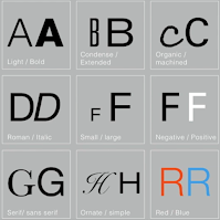
Contrast can be created using size, weight, structure, texture,
direction, color and form.

|
| Fig 1.2 Contract / Size |
Contrast/Size
Contrast in size is a technique that directs the reader's attention to a specific point. For instance, when there's a big and a small letter, the larger one naturally grabs attention first. This is commonly used in typography by making titles or headings significantly larger than the body text to emphasize their importance.

|
| Fig 1.3 Contract / Weight |
Contrast/Weight
Weight in typography is about using bold text or other design elements to create visual contrast and emphasis, not just through font thickness but also through various techniques like rules and shapes.

|
| Fig 1.4 Contract / Form |
Contrast/Form
Contrast of form is the distinction between a capital letter and its
lowercase equivalent, or a roman letter and its italic variant, condensed
and expanded versions of typeface are also included under the contrast of
form.
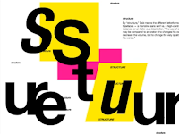
Contrast/Structure
Structure means the different letterforms of different kinds of
typefaces. For example, a monoline sans serif and a traditional serif, or
an italic and a blackletter.
Contrast/Texture
In typography, combining contrasts of size, weight, form, and structure in a text block results in what's known as texture. Texture describes how the lines of text appear when viewed up close and from a distance, influenced by both the letterforms and their arrangement.

|
| Fig 1.7 Contract / Direction |
Contrast/Direction
Contrast of direction in typography refers to the opposition between vertical and horizontal elements and their angles. It can dramatically affect layout, including the orientation of text blocks and the mixing of different line lengths and column heights.

|
| Fig 1.8 Contract / Color |
Contrast/Color
When using color in design, it's important to note that a second color is often less impactful in terms of contrast compared to black on white. Therefore, careful consideration should be given to which element needs emphasis, and attention should be paid to the tonal values of the colors being used.
Refers to the overall visual appearance and impression created by the
elements within a composition. It plays a crucial role in capturing
attention and making a lasting impression. A well-crafted typographic form
is visually engaging, guides the viewer's eye effectively, stimulates the
mind, and tends to be memorable. The harmonious balance between meaning and
form ensures both functional and expressive qualities in typography.

|
| Fig 1.10 Gestalt theory for organization |
INSTRUCTION
Task 2A: Key Artwork
For Task 2A we need to create a key artwork that serves as both a logo and artwork, using our name or initials. This key artwork will be used in Task 2B for various collateral.
- an elegant solution
- well balanced and composed
- not complicated or confusing that leads to a functional and
communicable key artwork
1. Ideation and sketches

|
| Fig 2.1 Inspiration sourced from Pinterest |
Ideas for key artwork based on my style and identity:
- Minimalist
- Unfussy
- Luxurious
I decided to use the username 'KIES' , which represents my English name
'KIE'.
I incorporated the key artwork ideas mentioned above into these
sketches, as seen with the minimalist and unfussy art style. Initially,
I sketched the letters 'KIES', attempting to make them appear simple but
not dull. I tried to utilize some negative space within the letters,
although there was space available, ensuring that the visual appearance
remained consistence.
2. Digitalisation

|
| Fig 2.3 Digitalize attempt 1 (Week 4: 20/09/2023) |
When I digitized attempt 1&2, I aimed to keep it simple and minimalist while using some negative space to prevent it from appearing dull. I also ensured that the visual appearance maintained the same letter form and shape.

|
|
Fig 2.4 Digitalize attempt 2 (Week 4: 20/09/2023) |

|
| Fig 2.5 Digitalize attempt 3 (Week 4: 20/09/2023) |
For attempt 3, I made some slight changes but still maintained the
minimalist and simple feel. I grouped all the letterforms together and
added a minimalist rectangular style on the outside.
In the last attempt, I used only the first letter of 'KIES' which is 'K', to convey the minimalist and simple feeling. I also incorporated some lines and positioned the entire letterform behind it to create a layered feel.
After receiving feedback from Mr. Vinod, I attempted to create a design
that is more memorable, simpler and can better reflect my
personality.

|
| Fig 2.7 Digitalize attempt 5 (Week 5: 27/09/2023) |
In week 5, Mr. Vinod allowed us to transfer our artwork onto a T-shirt using the template provided by him and then print it out in class. For my work, Mr. Vinod gave me feedback that I needed to reduce the space between the letters.
For Task 2B, we are tasked with animating the key artwork, creating an
Instagram account, and developing collateral branding around the key
artwork. The output must result from in-depth research and effectively
convey the intended message and mood established by the key artwork, both
visually and textually.
Mr. Vinod suggested us to use
Color Hunt to choose
our work's color palette.
After trying different color palettes, I chose the one below because it is brighter and includes navy blue and beige, giving it a more luxurious look. I believe the overall outcome will better match what I intend to achieve, a minimalist look that's not boring.

|
| Fig 3.2 The color palette that I chose (Week 6: 04/10/2023) |
After receiving feedback from Mr. Vinod, I have been working on expanding
the brand identity and creating something unique for the collateral
items.
Final Task 2 : Key artwork and Collateral
Fig 3.5 Final Key Artwork - black and white & color PDF (Week7: 11/10/2023)
 |
| Fig 3.7 Final Collateral: Hair Shampoo and Hair Conditional (Week7: 11/10/2023) |
 |
| Fig 3.9 Final Collateral: Tote Bag (Week7: 11/10/2023) |
 |
| Fig 3.10 Final Collateral: Customized Bottle (Week7:11/10/2023) |
 |
| Fig 3.11 Final Self Portrait - JPEG (Week7: 11/10/2023) |
Instagram
Instagram Link: https://www.instagram.com/kie.s3/
IG handle: @kie.s3
 |
| Fig 3.12 Final Instagram - mobile screen (Week8: 18/10/2023) |
REFLECTION
Experiences
I find a lot of fun in this task, but it is also quite challenging due to some limitations in creating the typefaces. Additionally, I need to be creative and ensure the designs are meaningful. However, creating the key artwork and collaterals is still a highly enjoyable experience for me. I learn new skills and gain more knowledge about mockups along the way.
Observations
I observe that color is equally significant, as it can enhance the product, highlight features, and set the mood.
Findings
I've learned that simplicity and creativity are important for a logo design to be easily remembered at first sight.
FEEDBACK
FURTHER READING
Good design is characterized by visual strength, where clear concepts are expressed in beautiful form and color. Achieving this involves various techniques, such as different scales within the same page and bold contrasts in graphic design or manipulating light, textures, and materials in three-dimensional design. Visual strength should not be confused with mere visual impact, as it represents intellectual elegance and is crucial for effective design. Therefore, achieving visual power deserves careful attention in the design process.
FEEDBACK
Week 4
General Feedback :
No impact.
Specific Feedback :
The meaning didn't come out clearly, need revise it again and make it
simpler, more readable, and more remarkable.
Week 5
General Feedback :
Overall okay.
Specific Feedback :
Reduce the space.
Week 6
General Feedback :
Instead of copying the logo and applying it to different things, need
to expand the identity and create something unique.
Week 7
General Feedback :
Consider a more imaginative presentation, such as propping your items, to prevent the page from looking empty. Also, ensure that you avoid unnecessary repetition on Instagram.
FURTHER READING

|
| Fig 4.1 Book cover: The Vignelli Canon |

|
| Fig 4.2 Pg24 Visual Power |
Good design is characterized by visual strength, where clear concepts are expressed in beautiful form and color. Achieving this involves various techniques, such as different scales within the same page and bold contrasts in graphic design or manipulating light, textures, and materials in three-dimensional design. Visual strength should not be confused with mere visual impact, as it represents intellectual elegance and is crucial for effective design. Therefore, achieving visual power deserves careful attention in the design process.


Comments
Post a Comment