26/04/2024 - 02/08/2024 (Week 1 - Week 15)
Lee Wing Kie / 0364251
Minor Project / Bachelor of Design (Hons) in Creative Media
Final Compilation
INSTRUCTIONS
Project Briefing
Group
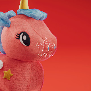
Project Name: Unicorn (Group 6) - Brandialogue
Client: Ms Zae, Mr.Damien
Group Member:
Lee Wing Kie
Koay Zi En
Yeoh Khai Xuan
Rachel Ng ZiQi
Koh Sin Yi
Glen Owen
Task 1: Innovative Project Proposal
Miro Board
Fig 1.1 Miro Board - PDF
Contextual Research
Fig 1.2 Contextual Research - PDF
Persona
Fig 1.3 User Persona - PDF
Survey Question & Analysis
Fig 1.4 Survey question & analysis - PDF
Design Progression
Here are the designs that I created. I'm responsible for creating the
website design and the prototype. I used the website references found
by my groupmate as inspiration and started thinking about the user flow. Our
website is mainly for selling unicorn plush toys. Therefore, the main focus
is on having a shop page and a smooth order process.
User flow

|
| Fig 2.1 Website user flow |
After finishing and finalizing the user flow, I started creating the
website wireframe using Figma.
Fig 2.2 Website wireframe
After finishing the proposal presentation, we realized our group's website
direction was a bit off. Initially, we thought that if all the products were
related to the unicorn theme, there would be no problem. After the
presentation, we were informed that we need to create a website for custom
unicorn plush toys. So, in the end this will be our main focus.
Final
For the final part, I continued working on the website design and
prototype, revised the direction to get back on track, and also took
responsibility for creating the social media content design.
Social Media
Since our product is plush toys, I used the Instagram posts of the famous
plush toy brand 'Jellycat' as references. All the social media post designs were completed in Adobe
Illustrator.

|
| Fig 3.2 Social media post progress in Adobe Illustrator |

|
| Fig 3.3 IG mockup |

|
| Fig 3.4 Sneak Peak - post 1 |

|
| Fig 3.5 Sneak Peak - post 2 |

|
| Fig 3.6 Sneak Peak - post 3 |

|
| Fig 3.7 Brand Value - post 1 |

|
| Fig 3.8 Brand Value - post 2 |

|
| Fig 3.9 Why choose us - all post |

|
| Fig 3.10 Our service - post 1 |

|
| Fig 3.11 Our service - post 2 |

|
| Fig 3.12 Our service - post 3 |
After finishing all the social media posts, other group members thought the
colors didn’t really match our color palette and the unicorn theme, but the
content and pictures can stay. So our group member Rachel helped to change
the colors.
Fig 3.13 Final version of all social media post content
Final Version Presentation Slides
Fig 4.1 Final presentation slides
Final Website (High-Fidelity Prototype)
After finishing the social media content session, I continued with the website design and created the prototype, adding elements, colors, and pictures to complete the website. At the end, Zien, Glen, Sin Yi, and I discussed the color palette and decided to use a color theme more related to unicorns. We chose bright and vibrant colors to ensure the palette looks fun, active and energetic.

|
| Fig 5.2 All the component |

|
| Fig 5.3 Prototype flow |

|
| Fig 5.4 Final homepage, shopping page and shopping page details |

|
| Fig 5.5 Our three services: shopping page details |

|
| Fig 5.6 About Us page, FAQ page and Community page |

|
| Fig 5.7 Contact Us page and Profile |
Final Website
REFLECTION
This semester was really stressful, but I’ve finally completed
everything. This curriculum taught me how to work with real clients and
collaborate with group members to create a new branding concept. I’d say
this is the most challenging module, and working with a good team can
make the process much more efficient. The theme was quite difficult,
even though we did a lot of research and surveys. I’m very thankful to
our lecturer, Mr. Mike, for his patience and for consulting with us
every week to ensure we were on the right path.
In this curriculum, I was in charge of the UI/UX part, which is design
the website. At the beginning, I felt stressed and struggled a bit
because the colors I used not very suitable. I really appreciate Mr.
Mike for providing us with examples and references that inspired me a
lot. I was also responsible for designing social media content. This
taught me a lot about designing effective posts for social media.
Overall, the branddialogue topic is quite suitable for a graphic design
background. I learned a lot of knowledge like branding, awareness, value
propositions and etc. This module gave me a new perspective on design,
we didn’t just learn design but also the fundamentals of business. How
to start from scratch, build a brand, and create value for consumers. It
was a very interesting module, and I’m grateful to have taken it this
semester.


Comments
Post a Comment